FPCC manages 70,000 acres across Cook County, serving hikers, families, cyclists, swimmers, and community event attendees across wildly different landscapes. The existing brand used generic tree and trail imagery that could belong to any park system anywhere, nothing geographically specific, nothing ownable. Auditing three competitor organizations confirmed the pattern. Every identity leaned on the same nature iconography with nothing to differentiate. The strongest systems used marks tied to a specific place, scalable across every touchpoint. That pointed directly to the opportunity.
Roles
Brand Design, UI/UX Design, Advertisement Design
Tools
Adobe Illustrator, Adobe InDesign, Adobe Photoshop

The mark is the shape of Cook County itself, divided into five zones, trails, water, community, outdoor recreation, and preservation, each with its own color drawn from the preserves. Early explorations used trees and leaves. The breakthrough was using the place itself as the symbol, something no other organization could claim.


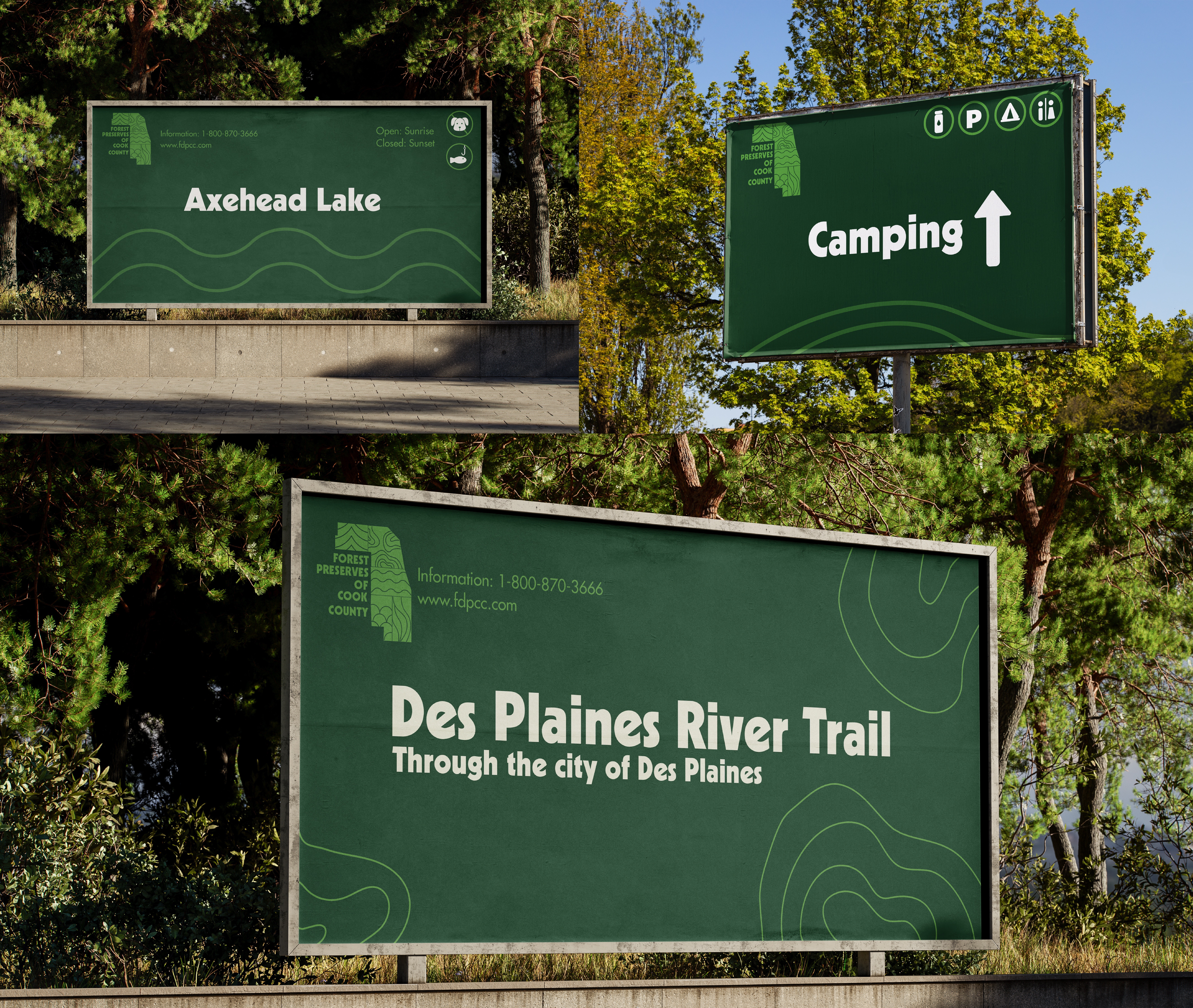
The color palette was the weakest decision, I'd push beyond expected nature tones toward something more ownable. I'd also test the mark with visitors unfamiliar with the county shape, and explore how the five zones could animate in digital contexts.

